Showing posts with label BA5. Show all posts

Texturing trials and tribulations...


This is the sort of look I wanted to achieve with my project. The rust was my particular focus although the blandness of the real roofs wasn't desirable to I gave mine a more stained appearance.

To texture the roof of my small shack I created a very simple gradient object in Illustrator.

I then copied that into Photoshop and applied some levels effects to reduce the contrast.

I created a few new layers above this and started to paint in some brown rusty colours. Long streaks and patchy bits to give it some variety.

The last layer I made used a photo of some real rusted roofing so I transformed, skewed and stretched that image to fit my perfectly aligned texture. I used the colour selection tool to only select the rusted parts of the photo reference and cut the rest out.

A blend of all of these layers gave me my final roof texture.


To make the normal map I employed the use of nDo2, a Photoshop extension that I used on a trial basis.

It works in a way that's very similar to how the sharpening tool works, you can control the size of the UV, the intensity, depth, softness and all sorts of other attributes as well as have a live 3d view of it.


It shows a 3D preview of your normal while you're editing it in Photoshop. This screenshot shows the most detailed and harsh settings for the most jagged elevations.


Using the preset, medium standard, you get most of the detail you want plus you're able to use four very simplistic sliders to achieve more/less details in the places you want

I used this tool to create all of my normal maps except for the bin-bags, which I tried using Mudbox instead.

In Mudbox I neglected to keep in mind that moving the wire-frame's fundamental structure would ruin the normal map output so it wouldn't properly align. I tried to remedy this by Photo-shopping the normal map but it's very difficult to get it to blend correctly. What might look fine in Photo-shop becomes glaringly obviously bad when rendered in 3D.

One of the bin-bags I made from a sphere in Mudbox actually looks alright as I managed to sculpt consistently in the right places from the lowest detail model all the way through to the highest level I used.

I tried to create a normal map for my model of a table using Mudbox initially but that turned out to be far worse than one I tried in nDo2.

For most of my assets I used textures from http://www.mb3d.co.uk who have a huge free library of textures for use in personal and non-profit projects so I grabbed several of these.


The great thing about these is that they're tile-able. For surfaces like pavements, roads and the interior floor these textures were invaluable.

Mudbox normals

 This is the last bin-bag I made as I had started the other two after a lecture with Lothar when he mentioned to start off in maya and make your own model and then sculpt the detail onto that.

The two bin bags after this were created from a sphere in mudbox.

I created the normals in Mudbox for all three and exported them all as .fbx for use in my scene in Maya.

I started off with a simple cube shape and generated more detail in it by inserting edge loops. I then deformed entire loops and specific edges so I could make the bag shape I wanted. The bow at the top was created by simply extruding 4 faces on each side opposite to each other and repeating the same process of detail creation by adding in edge loops. The only one thing extra I did to that loop was use the interactive split tool to create the inner seem where the bow is at it's thinnest running along the centre from top to bottom.


As you can see, straight away i neglected to keep the original form so the normal map is going to be unaligned.


Ignoring the fact the normal will be un-aligned I'm actually fairly happy with the wrinkles and tight look of this bag.


Although the ripples and wrinkles look kind of silly in this final sculpt, I think they look better when applied to the low poly model as they lose their three dimensional nature so their flaws are less obvious.


Apologies for the golden bin-bag, Mudbox refused to render this properly with default lighting. This is by far my most aggressively wrinkled and dented bag, it looks as though it's had the air sucked out of it similar to when you have fabric or soft items in a bag and squeeze it leaving it looking like this. It's my most interesting of the three bags but doesn't quite make sense considering it's location (outside the home).

CS mini presentation

How the genre has changed through improvements of technology.


Andre Agassi Tennis - Controls were difficult to execute properly. you needed to move to the ball aswell as aim the shot while also being pin point accurate. the AI would even struggle. It's almost a miracle to get a rally going.
sprite graphics 16 bit colour poor physics and hit detection

Sega mega drive, named to represent  superiority (Mega), and speed (Drive)
most popular games sidescrolling platformers like sonic and beat em ups all much easier because of the D-pad allowing for 8-directional movement and the 3 buttons for various attacks or moves.

Marketed using celebrities and innuendos "the more you play with it the harder it gets" obviously not a very family friendly joke. Word play - To be this good takes AGES, to be this good takes SEGA, this would probably be considered quite tacky now.

Andre Agassi Generation - Slick interface, fluid controls, and realistic gameplay
3d graphics, 32bit colour much more forgiving hit detection and more realistic physics

PS2 controller setting the standard right up into this generation for controls. extra joysticks and split-d-pad allow for much easier control and much more variety paving the way for nearly every genre of game available today.

Advertising campaign gave the impression that the console was a force to be reckoned with, serious, bold and overpowering, sleek tone to their ads.Down right creepy ads like the one featuring the girl with the incredibly disproportioned face. DO NOT UNDERESTIMATE THE POWER OF PLAYSTATION


Grand Slam Tennis - beautifully intuitive, surprisingly strong tennis game and an interesting evolution of the Wii controller too
realistic graphics, 32 bit colour hit detection is immaculate thanks to wii-motion-plus physics are nearly exactly the same as reality.

First console to ever fully embrace motion controls as the default. fitness titles and sports titles are amongst the most popular and sell incredibly well amongst children and adults.

Contrasting the PS2, the wii's advertising campaigns was a very bright and lively affair, family friendly and focusing on fun. It quite literally contrasted the PS2's very dark visuals with white being the dominant colour of the Wii ads.

Final note, the advancement and mass production of hard ware help create more powerful devices which enable more vibrant and interesting game possibilities.

Light and colour

Light and colour


The first image is a photo of hikers in the Indian Himalayas.
In this image you can see the snow reflecting light from the sun closer to the sun, and further away it begins to appear less reflective and have much more soft lighting. The colour of the sky is reflected much more strongly in the shadow of the hikers and because of the relative brightness of their dark side and the sky they appear to be silhouettes. The fog in the distant hill range reduces the intensity of the light and darkness that would be apparent if closer. They darkest parts of those hills aren't nearly as dark as the sillhouettes of the hikers and the brightest parts of the fog are just about as bright as the snow to the side of the image not reflecting the suns' bright light at us.
There is very little colour to speak of aside from that of the sky being reflected from the snow. The yellowish orangey tinge on the horizon is not rich in colour, I think this might be the case because this is shot from so high up. Maybe the fact we're above it and seeing the reflected light as opposed to being beneath the fog/clouds where the light would have been scattered through the fog and we wouldn't be able to see the direct sun light. The refracted light would have had to travel further and because we know colours are richer in the shade it's not entirely false for me to assume that those colours would be richer beneath the clouds.


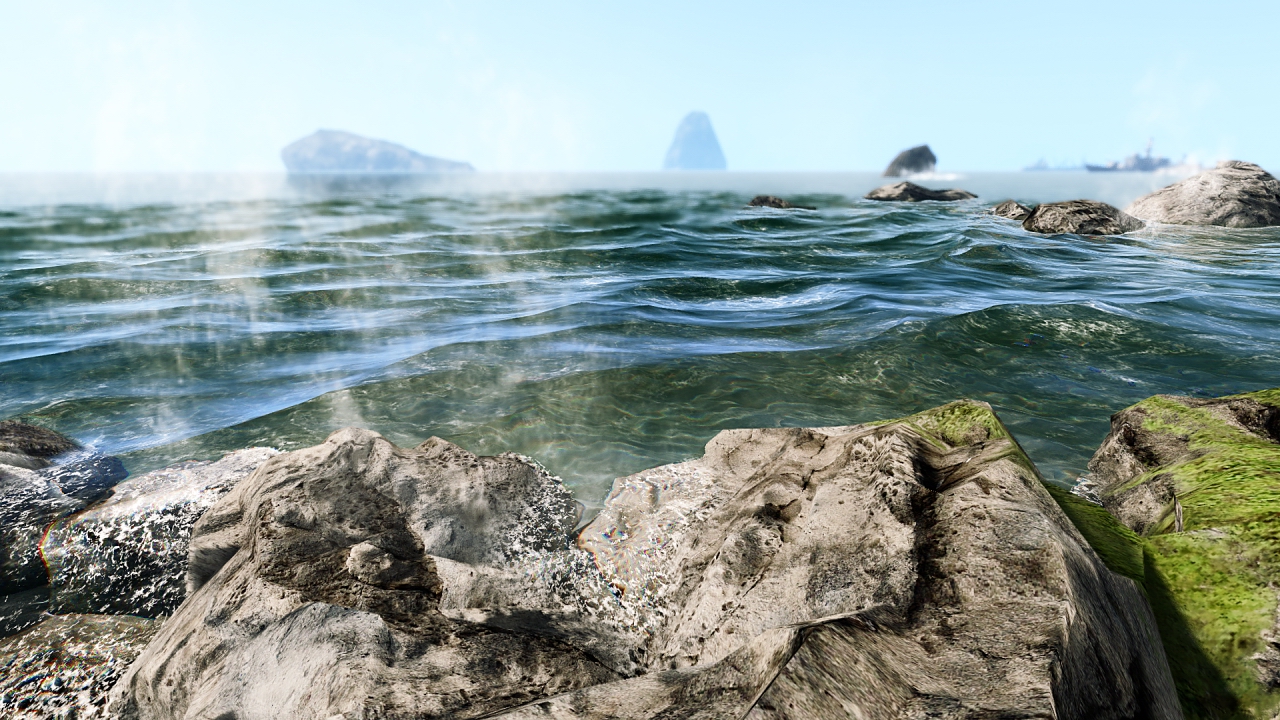
This image is a screenshot from Crysis.
I think the user who took this had custom shaders or ENB mods or was simply using a custom config.
The water is refracted at the edge of the rocks creating the rainbow effect. The water is clearest the closer you are to it and reflects more light from the sky the further away you look (Fresnel effect). The blue hint on the distant objects indicates they are far away because of particulates in the atmosphere which absorb the weakest light frequencies. The weakest frequencies are reds and yellows leaving blues, the longest waves to still be visible. The intensity of the light from those distant objects is much lower as a result of the light having to pass through the atmosphere. The brightest pats of this image are the highlights on the rocks and white froth of the sea. both of which are right next to the viewer. The darkest shadows too are the closest becoming more and more washed out the further from the viewer the shadows are.
The brown of the rock is much richer in the darker, shaded areas of the rock, the same goes for the mossy green to the right of the image.
Underneath the surface of the water there is a caustic effect on the sand.


This painting by George Grie shows sub-surface scattering in the clouds as they do not fully reflect or absorb the light of the moon.
The water fall is lit by bounce-light which is why it has no harch shadows, nor do the huge statues holding the crust of the earth up. The boat however does have a harsh shadow as it is in direct light from the moon.

Notes from the lecture

light can be - Absorbed , reflected , refracted

you can see absorption when objects appear to be a certain colour or black. they absorb all the colours they're not reflecting.

reflected light is simply light that bounces of the object. the light that because of the objects properties is able to proceed in it's course as opposed to being entirely nullified.

refraction is when light is bent, this happens through water or glass or other transparent substances. the substance has a particular make up that channels the light in a specific fashion.
this very property is utilised in 3d glasses you wear to the cinema

frensel effect - how reflective a substance is based on viewer position
water is transparent from above with very little reflection
from next to the surface looking along it you can see reflections much more clearly and see through the water much less.

sub-surface scattering
when an object doesn't fully absorb or reflect light it will pass through it
you can see this effect by shining a torch through your finger tips or your ear using a mirror. the light appears very soft and will glow with intensity relative to the thinness of the substance.

BA 5 Production | Platform and Distribution

Project Leader: Lothar

We'll be creating digital assets. 2D, 3D and integration in a real-time environment.
Continue with previous project or create new game design document over holidays.
I'll be continuing on with the existing game design document and create 3D assets for a street in a slum.
Walk through, block out level (level design), fully playable level (only really feasible for a 2D platformer)
Cryengine, UDK, GameSalad, Stencil
I'll be making a walk-through in Cryengine 3.
We will have no scripting/coding lessons
We're required to produce a video and playable demo if we choose to work on a 2D title
Video and walk-through and the level for 3D
Video of a fly-over and level for level designing

CS - Platform + Distribution
Relationship between the platform and content
Independance of platforms and their exclusive content
We're aiming to have a facebook timeline of the last 2 decades of development in the field
We can look into the hardware and how that's affected the content on each platform which in turn will affect distribution to a degree.
Innovations in game content and the platforms themselves.
We'll need to blog our research

5 minute presentation on holidays' research

Cryengine session with Lothar

He explained how you can easily change the time of day as well as tens of attributes that change lighting and fog effects within the time of day settings.

We can use bitmaps for creating a map. The change in tonal values change how high the land is.

The resolution of the level is multiplied by the unit measurements to give you the total real area.
1024x1024 level multiplied by 2 metres as the unit of measurements will result in a 2km² map.

Upon creating the level we should name it, then give it no project style, and assign a terrain height we think is suitable. The height is the value times the unit of measurement and will determine the maximum height of the map. The brightest whites of your bit map will reach this peak. The blacks will remain at below sea level.

You can also use the generate terrain tool which uses Cryengine's own random terrain generator if you don't mind how it looks.

All assets created for the Cryengine must be converted to the .CGF file format.

If we need place-holder objects we can use the solid tool which is a very simple cube creation tool that applies the basic checker texture to itself.

At any time we can jump into the level and see how it feels to walk around.

He showed us how to use simple texture brushes so we can paint our terrain and that all of the default textures have sounds assigned to them so when you walk over them they all make the correct foot-step noise.